
Project Overview
The Product:
Shovkovo is a Ukrainian brand that specializes in 100% silk accessories for sleeping and self-care. It was founded as a tribute to the memory of a beloved mother. The brand caters to women between the ages of 18 and 50 who value comfort and prioritize self-care. Shovkovo's ultimate objective is to promote self-love and care among individuals.
Project Duration:
May - July 2023
The Challenge:
The brand has been relying on Instagram as its primary distribution channel for product sales. However, the client now seeks to develop a dedicated website to enhance lead conversion rates and streamline the purchasing process for customers.
The Objective:
To design and develop a user-friendly website that offers clear navigation, ensuring a seamless ordering process for Shovkovo's products, and a streamlined payment experience for customers.
My Role:
As a UX Designer, I have conducted thorough user research to understand the target audience and their needs. By gathering insights and feedback, I have ensured that the design of the website aligns with user expectations and provided an intuitive and seamless user experience.
As a UI Designer, my responsibility was to create an aesthetically pleasing and visually appealing design for the website. This includes selecting appropriate colours, typography, and layout to create an engaging and attractive user interface.
Additionally, as a developer, I have leveraged my skills in building websites on the WordPress platform. This involves implementing the design, integrating necessary functionalities, and ensuring smooth performance and responsiveness across different devices and screen sizes.
By combining these roles, I have aimed to create a well-rounded website that not only looks visually appealing but also provides an optimal user experience for Shovkovo's customers.
Understanding the User
To better understand users’ needs, I conducted several interviews and created two personas based on the receiving data. The primary user for the Shovkovo website was identified as women between the ages of 18-50 who value comfort and self-care. They are likely interested in high-quality accessories for sleeping and self-care made from 100% silk. They prioritize their well-being and are willing to invest in products that enhance their comfort and relaxation.

Problem statement:
Sophia is a young businesswoman who struggles to find high-quality silk accessories that align with her values of sustainability and ethical sourcing. She is frustrated by the lack of options available in the market that prioritize both comfort and eco-consciousness. Sophia needs a reliable source for silk accessories that are not only luxurious but also produced in an environmentally responsible manner.

Problem statement:
Emma is a busy working mother who finds it challenging to navigate through the online shopping process for sleep accessories. She often encounters websites with confusing navigation, limited product information, and an overwhelming number of options. Emma needs a user-friendly website that simplifies the buying process and provides clear product details to help her make informed decisions and find the perfect sleep accessories.
Also, the user’s paint points were determined through the research.
1. Limited Access to High-Quality Silk Accessories:
Users struggle to find silk accessories that meet their standards of quality, sustainability, and ethical sourcing.
2. Lack of Product Information:
Users face difficulties in accessing comprehensive and detailed information about the silk accessories, such as fabric composition, care instructions, and product dimensions.
3. Complex and Confusing Navigation:
Users get frustrated with websites that have complicated navigation structures, making it challenging to find the desired products or navigate through different sections of the site.
4. Overwhelming Product Options:
Users might feel overwhelmed by the vast array of product options available, making it difficult to make a decision and find the most suitable silk accessories for their needs.
5. Inefficient Buying Process:
Users encounter a cumbersome buying process, including issues with adding items to the cart, difficulties in selecting product variations (e.g., colour or size), and complex checkout processes.
Starting the Design
After identifying the difficulty with website navigation as a primary pain point for users, I took that into consideration and developed a comprehensive sitemap. The main objective was to strategically organize the information architecture in order to enhance the overall website navigation experience. The chosen structure aims to simplify and streamline the user journey, making it easy for users to find the information they need effortlessly.
I presented two different variants of the sitemap to the client in order to gain a better understanding of her requirements. Following a brief discussion, we collectively decided to proceed with the second variant as the foundation.


Next, I sketched several variations of paper wireframes for the home page, exploring different layout options.
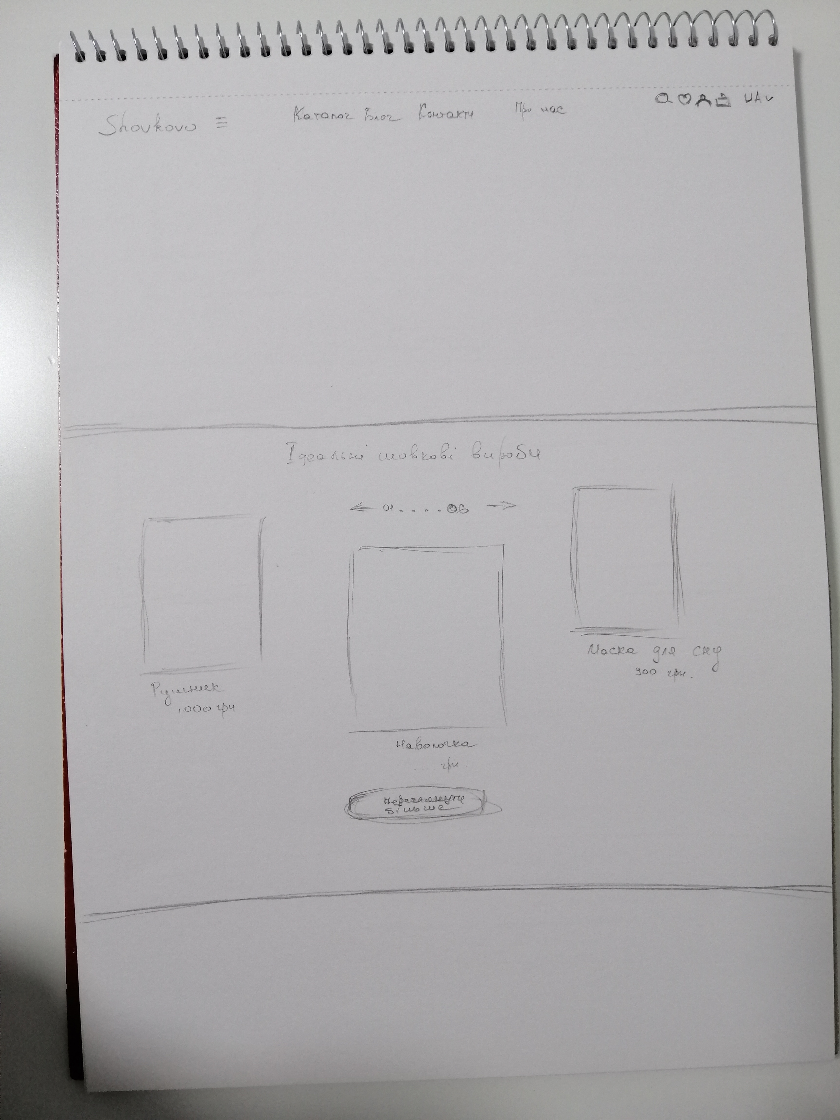
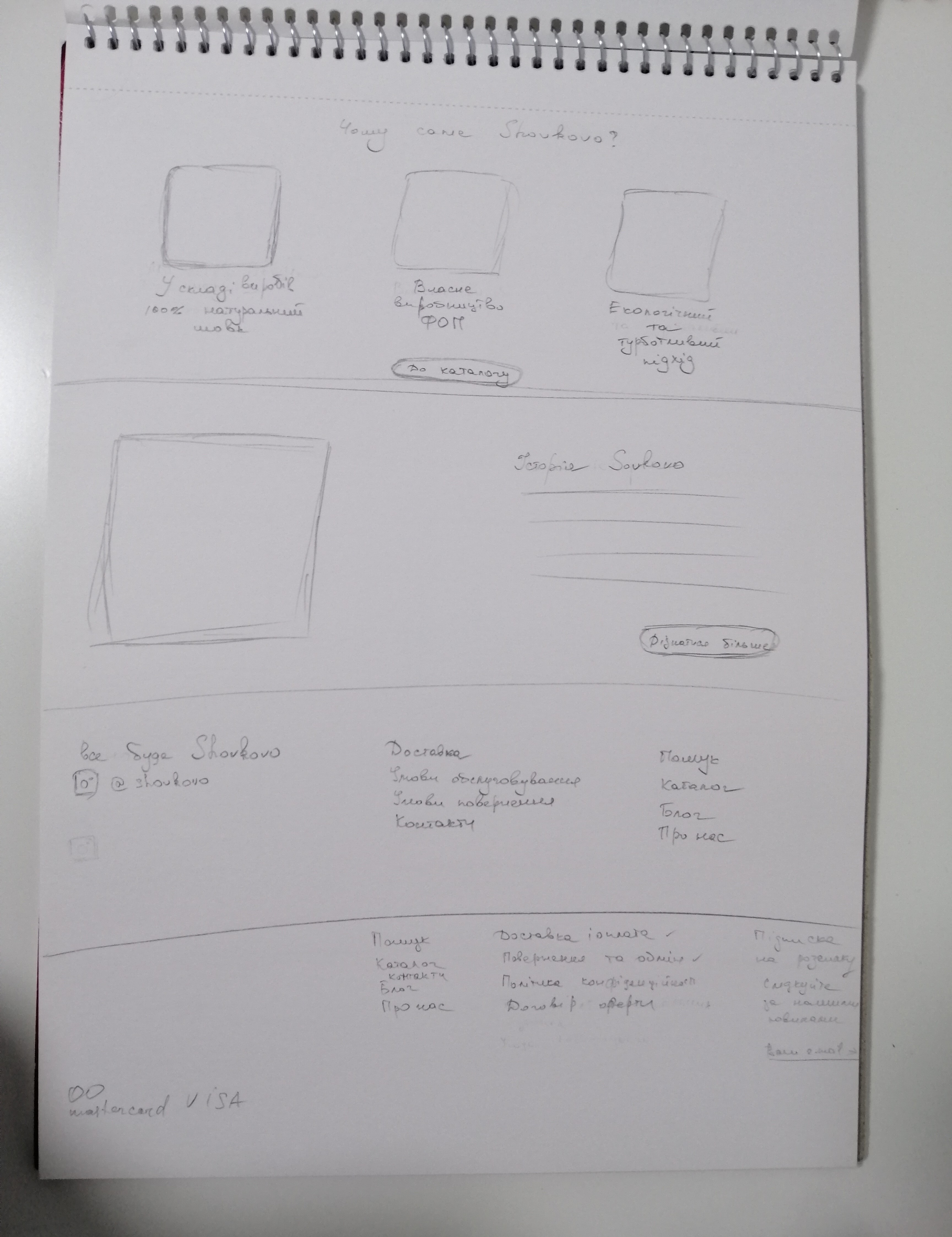
Taking into account the client's existing brand identity, including the recognizable logo, motto, and colours such as Raisin Black (1F1C21), Timberwolf (E8DFD8), and White (FFFFFF), I carefully considered all their requirements as well as the user's navigation challenges. With this in mind, I proceeded to create mockups that were tailored to address those pain points effectively.
The high-fidelity prototype (click to explore the design).


Implementing the Design
After receiving approval from the client, I proceeded with the implementation of the design. For the website development, I chose to use the WordPress platform, utilizing the popular and versatile Flatsome theme, which is well-suited for e-commerce websites. My primary objective was to seamlessly integrate and adapt my design to the Flatsome theme.
During the implementation phase, I carefully reviewed and adjusted certain design elements to ensure they aligned with the capabilities and features of the Flatsome theme. This involved making necessary modifications and enhancements to optimize the visual appeal and overall user experience of the website.
By leveraging the flexibility and functionality of the Flatsome theme, I was able to bring the design to life while maintaining a consistent and cohesive user interface. The combination of the customized design and the powerful features of the Flatsome theme resulted in a visually appealing and user-friendly website for Shovkovo.
Throughout the implementation process, I closely monitored the website's performance and conducted thorough testing to ensure optimal functionality across different devices and browsers. Any necessary refinements and adjustments were made to guarantee a seamless and engaging user experience.
Overall, the implementation phase was focused on translating the design into a fully functional website, carefully adapting it to the chosen platform, and continuously enhancing its visual appeal and usability using the capabilities of the Flatsome theme.
Shovkovo website (click to explore the website).

